
MUSEO DEL PRADO
MUSEO DEL PRADO
OVERVIEW
Client
Museo del Prado
Visual Identity - TOV - Art Direction
Skills
Illustrator - Photoshop - After Effect
Tools
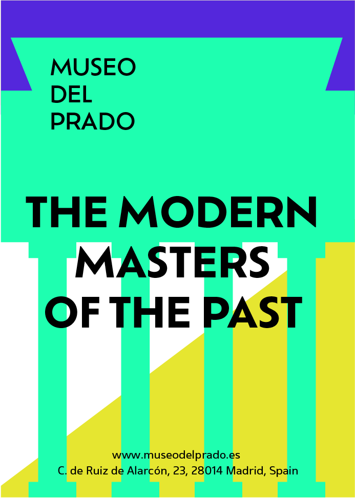
With this rebrand, the aim was to move the organisation away from its corporate image to attract a younger audience.
As Gen Z are often on screens and bombarded with flashy colours, the goal was to replicate that and intrigue them, to instil interest, and to let them see classic art with curious eyes.
*student work with further development done autonomously.
Details
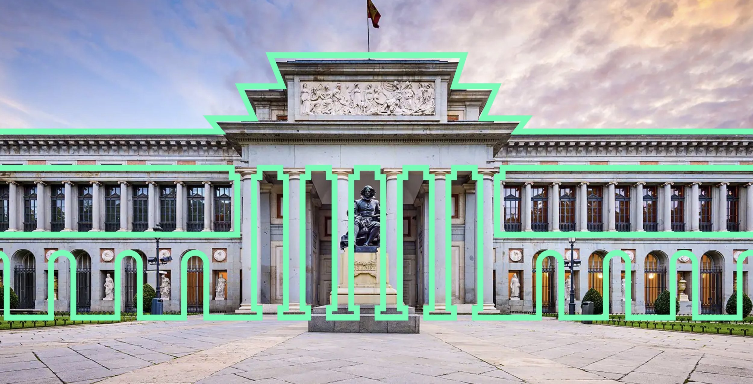
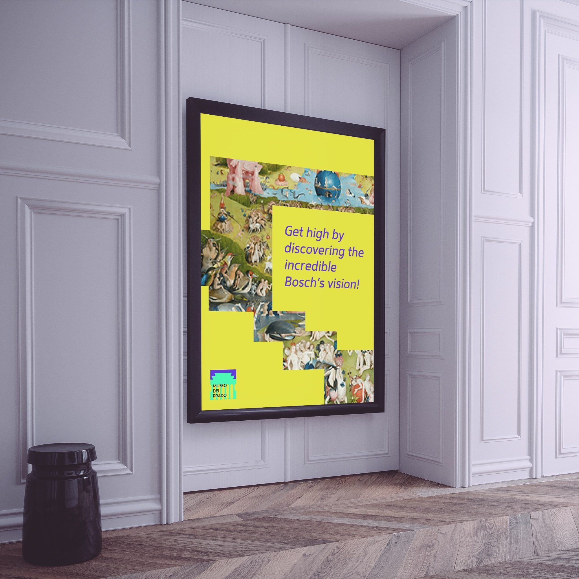
Each of the three entrances serves as a gateway to the Prado Museum and a symbolic tribute to the respective artists and art movements they represent.

Velazquez Entrance
Geronimo Entrance
Goya Entrance

The three shapes combined create abstract yet recognisable patterns.
These can either be a logo or a code for specific exhibitions or, used singularly, as a device for posters and banners.

The bright colours give a digital feel and make the devices stand out from the sober classic art colour palette creating an attractive contrast.