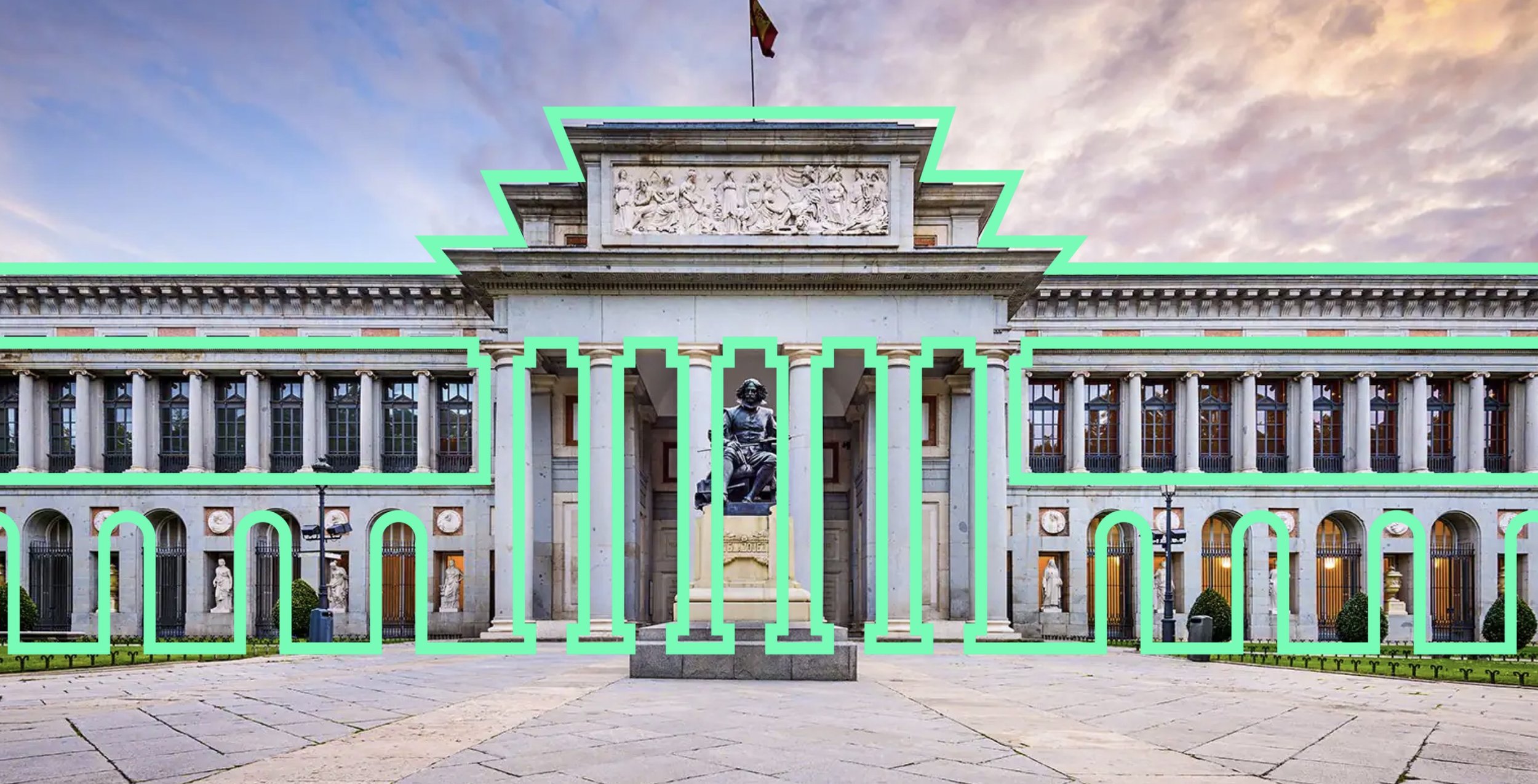
Concept rebrand for the Museo del Prado
This self-initiated project explores a visual direction aimed at repositioning the Prado Museum for a younger, digitally native audience while respecting the institution’s cultural authority.
The challenge was to shift away from a corporate, institutional tone without compromising the museum’s historical weight. Rather than competing with the visual overload common to Gen Z digital spaces, the system focuses on creating contrast, using bold colour and graphic forms to reframe classical art as relevant, accessible, and engaging.
The identity is built around the geometry of the museum’s three main entrances, which informed the core visual structure. A vibrant, high-contrast palette was introduced in opposition to the traditionally muted tones associated with classical art, creating a clear tension between heritage and contemporary culture.
This project is an independent conceptual exploration and not affiliated with the Museo
del Prado.


