
LE GRANIER HOTEL
LE GRANIER HOTEL
OVERVIEW
RM Developments
Client
Visual Identity - Naming - Art Direction - TOV
Skills
Tools
Illustrator - Photoshop - After Effects
RM Developments have unveiled plans to turn a portion of Silo #5 (grain elevator) into a 100 rooms hotel aimed at curious travellers who want to visit special holiday destinations.
This new hotel concept based in Montreal, Canada, modernises the old architecture and ditches the unnecessary glamour for a unique, memorable stay.
*concept 1: self initiated work / concept 2: student work
Details
CONCEPT 1 - LE GRANIER HOTEL


CONCEPT 2 - L’USINE HOTEL
CONCEPT 1
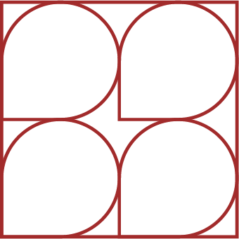
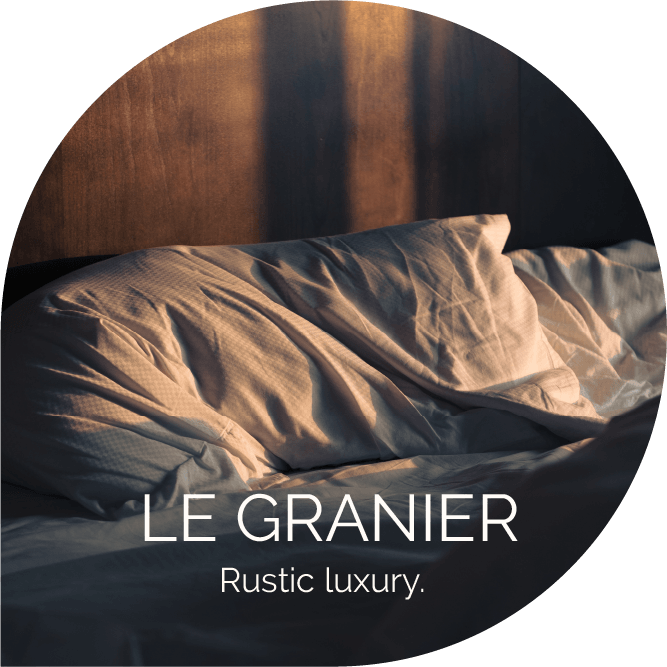
Le Granier (French for The Granary) is inspired by the original function of the building as a grain elevator.
The hotel offers a warm, original and welcoming stay in the heart of Montreal.
The overall colours are hearty and soft to provide a sense of comfort and warmth.
*self initiated work

The logo is created with cereals-like shapes which represent different rooms and areas within the hotel that is represented by the square.


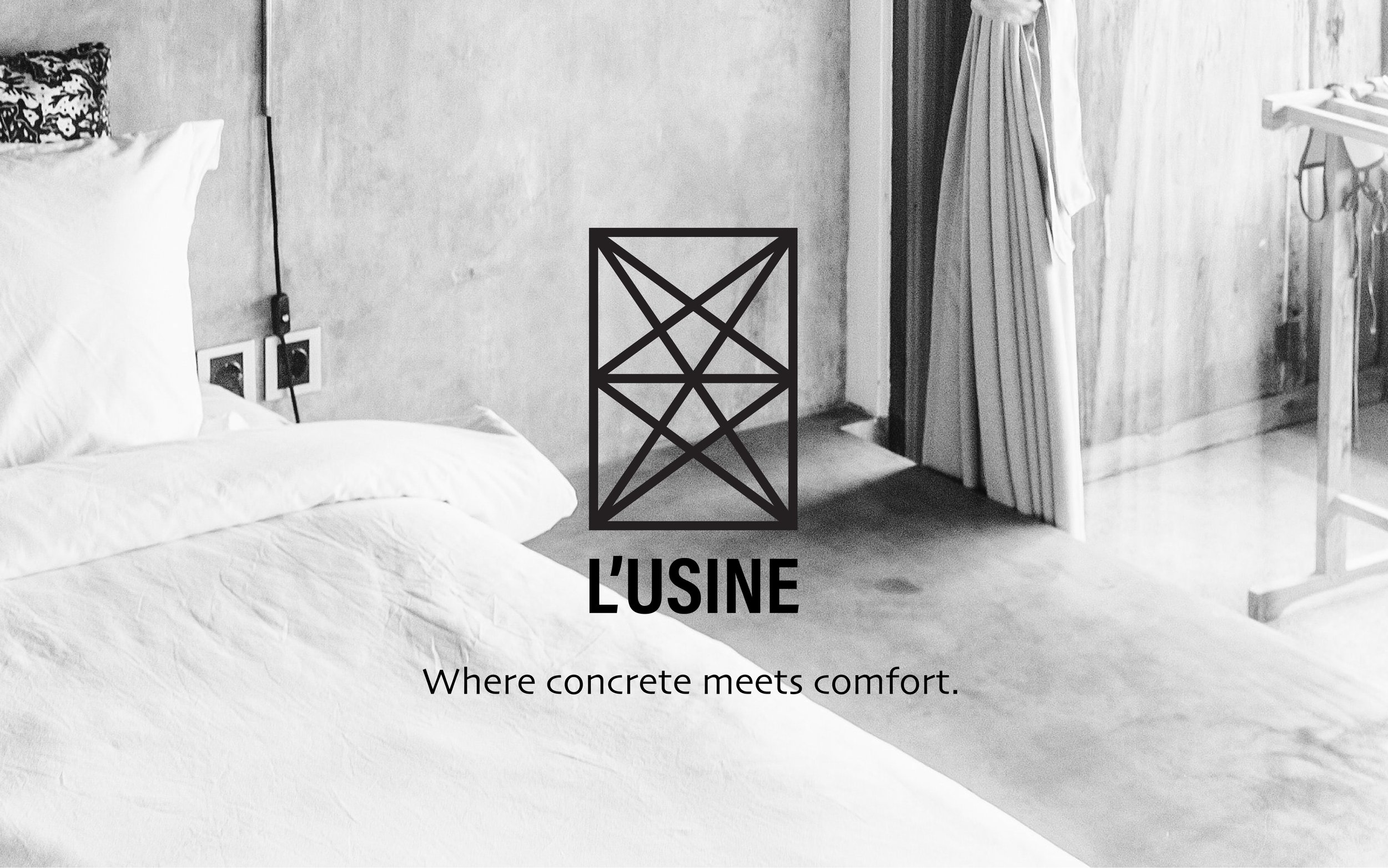
CONCEPT 2
L’Usine (The Factory in French), takes inspiration by the structure of the building where metal cables create geometrical patterns.
The colour scheme is mostly neutral to give an industrial feel. A hint of copper provides a premium touch.
*student work